Graphs that tell a story
When the researchers have accumulated all their data, and have all their numbers in place, the next question that they have to deal with is how they plan to present all this information. They would naturally want to present it in a manner that is easy for the audience to read and interesting for them to understand. One of the most common ways of presenting numbers in an appealing format is through graphs.
The human mind is trained to respond easily to pictures. If people are asked to read and understand pages and pages of numbers, they might not be able to do it. But they understand lines going up and down on a graph and are able to figure out which variable is in the positive and which is in the negative. They understand bar diagrams and histograms and scatter plots, and find that the data given through these methods is easy to comprehend.
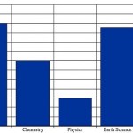
The researchers have to consider how many variables they plan to plot on the graph. If they plan to just show a comparison or a movement of two or three variables then they can go with the line graph. But if they were to show a comparison of many variables then they might go with a bar diagram. If they wish to impart some special effects to the graph, they can apply 3D effects on the graphs.
Many researchers like to maintain some consistency across all the graphs that they are displaying throughout the project. Other researchers like to use a variety of pie charts, histograms and line graphs to make their point. However, all researchers should understand that their graph needs to tell a story and tell the story clearly.


Leave a Reply